Branding under the spotlight

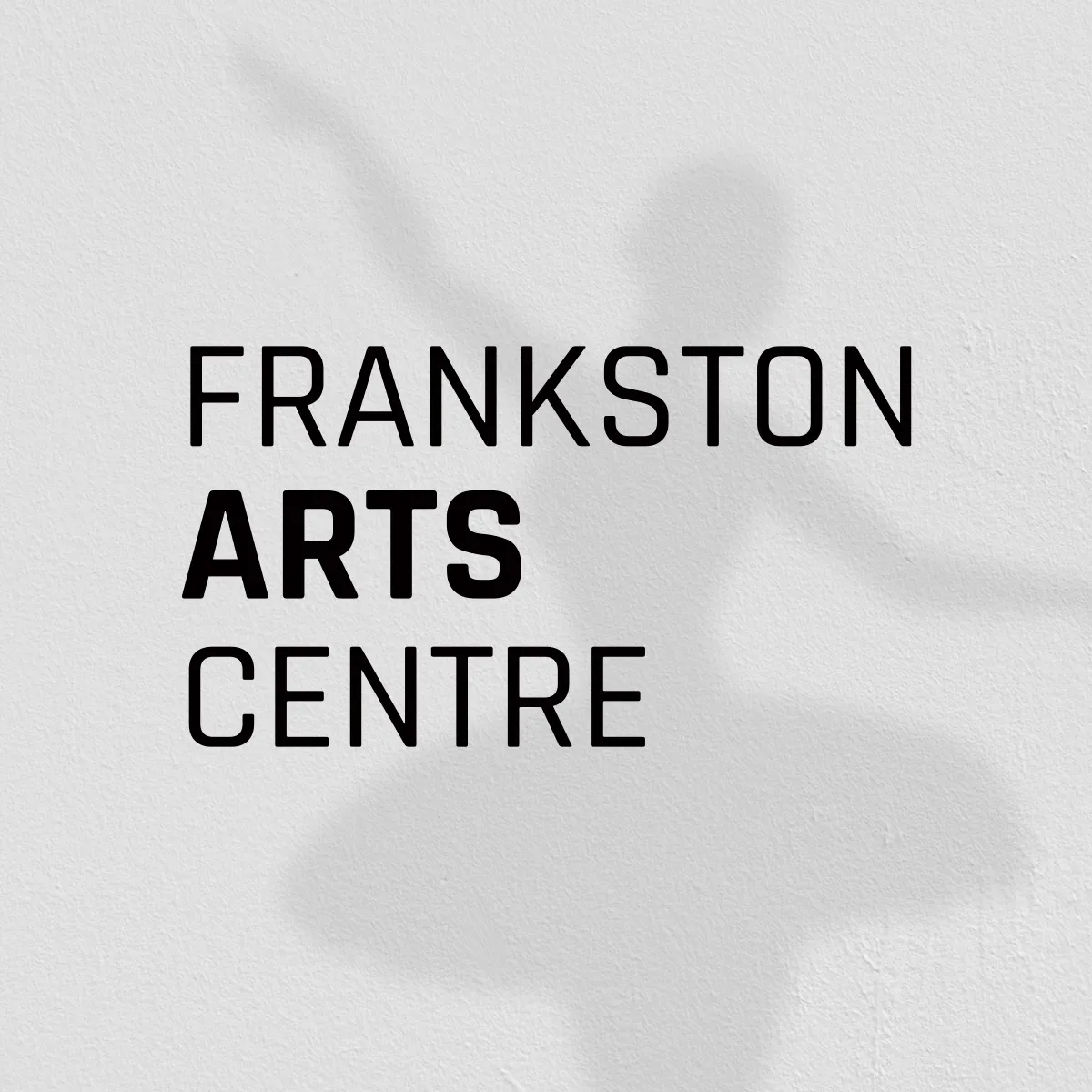
Frankston Arts Centre (FAC) needed a clearer, simplified identity.
A branding refresh that would help its logo resonate with its audiences, while simplified brand usage guidelines to enable greater consistency across a vast range of applications and users. Cue PIER. One of the main challenges for FAC was needing an identity that could share the spotlight with busy, colourful show branding, and be applied consistently by different show promoters. So, we created a new clean type-based logo and simplified the colour palette to enable FAC to take the stage alongside its show brands.
We are so proud of our refreshed logo and branding; it has really elevated our visual identity. The brand usage guidelines have given us great confidence that our brand will be applied correctly and consistently both internally and by other show promotion companies.

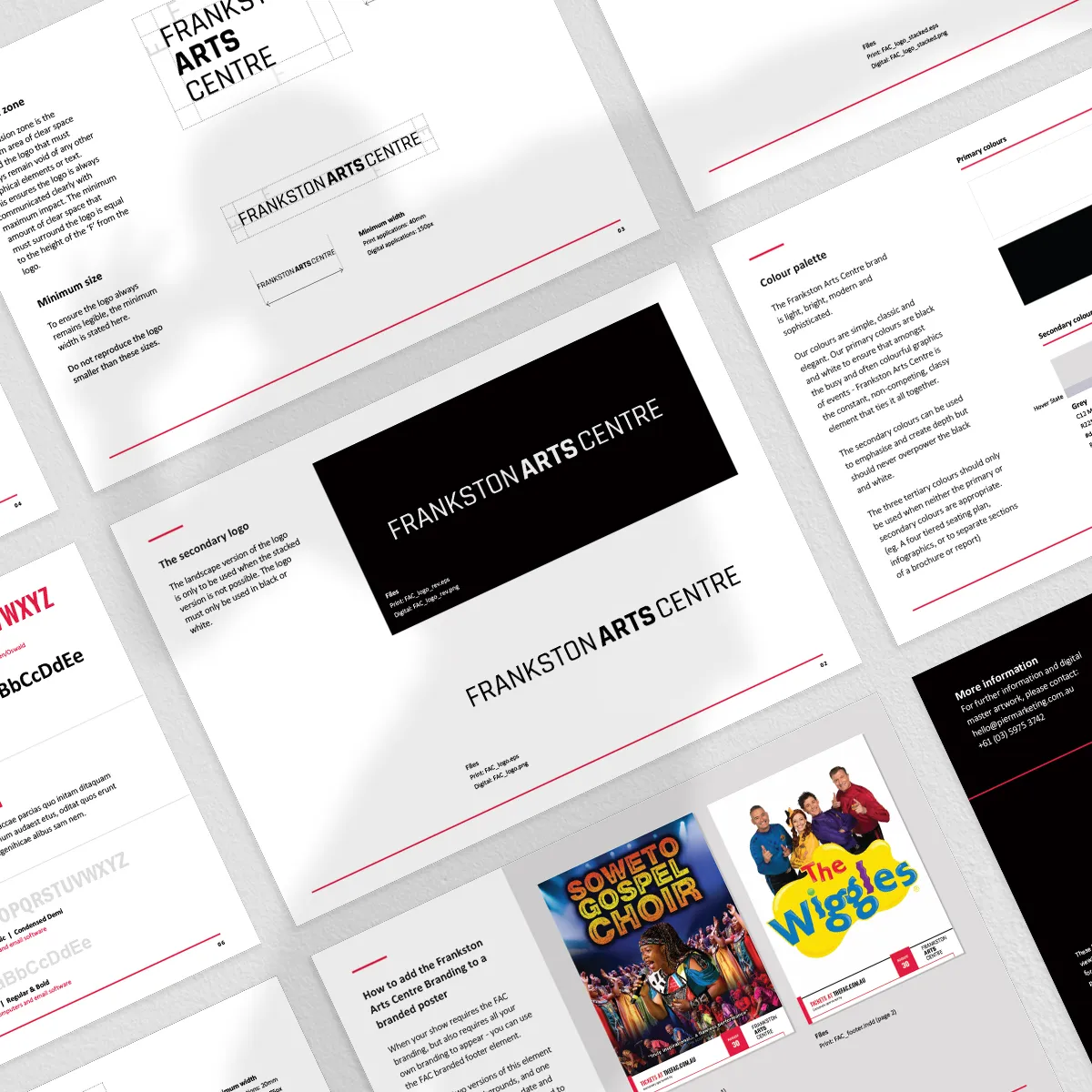
A detailed set of brand usage guidelines was designed to enable correct application of the brand in complex scenarios, and by different designers, while a simple one-page guide was produced for day to day internal use. This ensures correct representation of the brand, regardless of who was applying it.
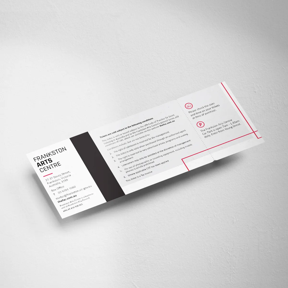
Alongside this, a set of template material was created to ensure consistency and compatibility of the new brand across different media and touchpoints - we’re talking certificates, gift vouchers and signage. The templates give FAC internal teams the ability to produce their own collateral in-house whenever they need.
Branding outcomes
The new FAC brand identity and its consistent application has strengthened brand recognition and repositioned them as a leader in their industry, while the logo sits alongside show branding seamlessly. Curtain call PIER.
Branding outcomes
The new FAC brand identity and its consistent application has strengthened brand recognition and repositioned them as a leader in their industry, while the logo sits alongside show branding seamlessly. Curtain call PIER.
Got a problem you're ready to solve?
Let's chat
A campaign to kick the Avenger into gear

A picture-perfect Barbie blitz

Analysing Caseware’s customers

BIC Australia reach for a new lighter

Creating a digital engine

Drawing customers into the vicinity
Fresh insights for a long-time client

Human branding

Improving business health with strategy
