No hemming and hawing for this brand
Pete and Anita came to us with a clear purpose:
They wanted to be known as approachable builders with a focus on sustainability while sharing their love of Scandinavian design. Their goal was to normalise sustainability in building, stand out in a competitive industry and convey to clients both their professionalism and their approachableness. Yet their previous business name didn’t reflect this mission or any of the things that made the brand unique. Pete and Anita needed a new brand. They also needed a website. We dived in.
PIER helped us to realise our business' potential and we are thrilled with the end result. Georgia, Brenton and the rest of the team were patient, efficient and approachable. We'll be more than happy to work with PIER in the future. Highly recommend!
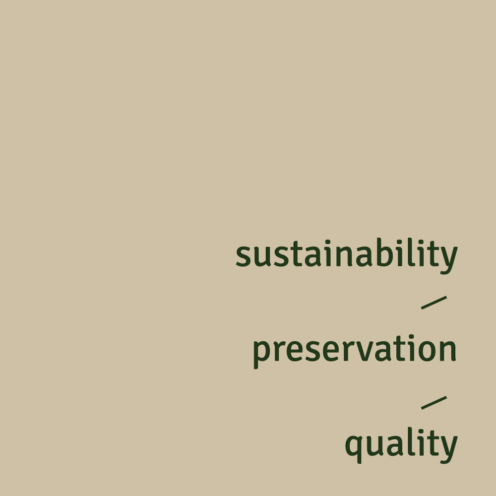
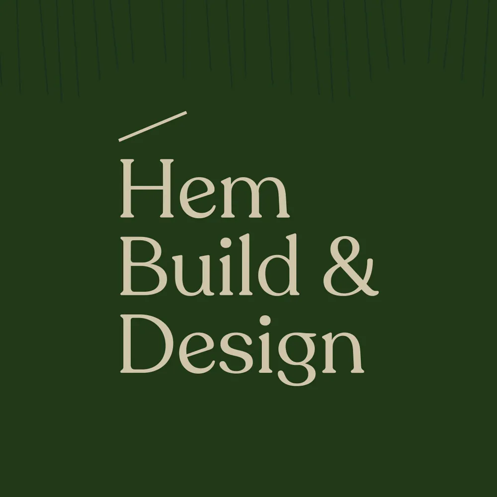
We started with a discovery session where we learned about Pete’s construction experience in Scandinavia and Anita’s passion for sustainable house plans and interiors. Our first priority was to determine a brand position and name. We settled on ‘Hem Build & Design’ — ‘hem’ being the Swedish word for home. As well as being a nod to the brand’s Scandinavian inspiration, ‘hem’ is simple, clean and easy to pronounce. We also established Hem’s core values: clarity, preservation and quality.
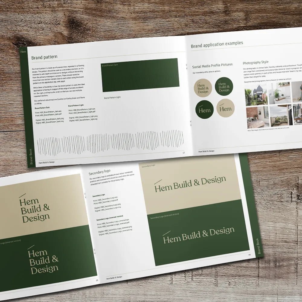
From there, the logo design began to flow. We crafted a logo with a dash symbol over the ‘H’ to create a little roof — a subtle reference to the building industry and a minimal yet memorable flourish. The typography is designed to convey structural integrity coupled with approachability, and the colour palette (deep eucalyptus green and natural bone) conjures feelings of renewal, calm and trust.

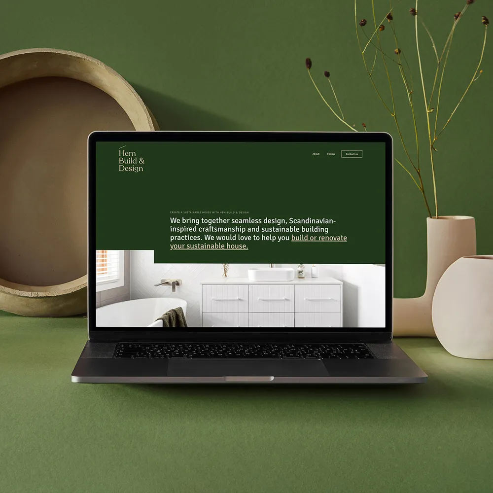
Next, we designed a website with plenty of empty space around the content to allow the words and images to take centre stage. Our goal was for the journey through the website to flow seamlessly — like a well-designed home. We did this by creating unique designs for most sections; varying the image sizing and alignment; combining key headings, sentences and call-to-actions into a single statement; and linking to relevant words rather than adding buttons. The last piece of the puzzle was an email signature and letterhead to ensure Pete and Anita could communicate with consistent branding.
Next, we designed a website with plenty of empty space around the content to allow the words and images to take centre stage. Our goal was for the journey through the website to flow seamlessly — like a well-designed home. We did this by creating unique designs for most sections; varying the image sizing and alignment; combining key headings, sentences and call-to-actions into a single statement; and linking to relevant words rather than adding buttons. The last piece of the puzzle was an email signature and letterhead to ensure Pete and Anita could communicate with consistent branding.

The outcome
With a new name, new logo and new website, Hem Build & Design is a business reimagined. The new branding accurately reflects Hem’s unique selling proposition (USP) in the marketplace, and this revamp will support the business as they grow and evolve over many years.
The outcome
With a new name, new logo and new website, Hem Build & Design is a business reimagined. The new branding accurately reflects Hem’s unique selling proposition (USP) in the marketplace, and this revamp will support the business as they grow and evolve over many years.
Got a problem you're ready to solve?
Let's chat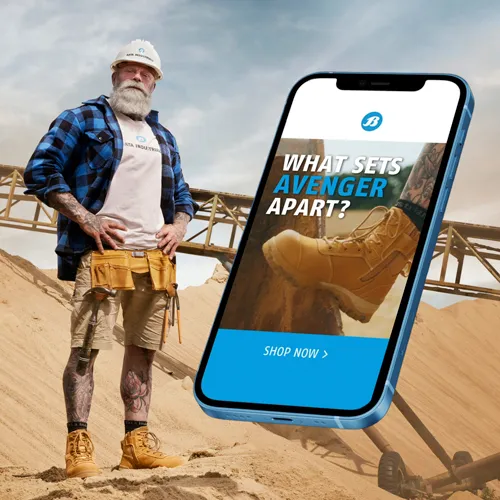
A campaign to kick the Avenger into gear

A picture-perfect Barbie blitz

Analysing Caseware’s customers

BIC Australia reach for a new lighter
Branding under the spotlight

Characterising critical care

Creating a digital engine

Drawing customers into the vicinity
Fresh insights for a long-time client
